

Inspector's window |
Inspector window function
Additional information about the selected object or the actions performed is displayed in the inspector window.
Layout of the Inspector's window
The following figures show the elements of the Inspector window:
|
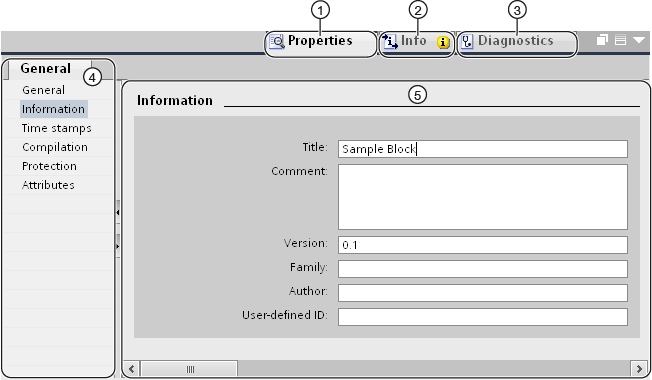
① |
Properties tab. |
|
② |
Information tab. |
|
③ |
Diagnostics tab. |
|
④ |
Area navigation in the "Properties" tab. |
|
⑤ |
Contents of the "Properties" tab. |
|
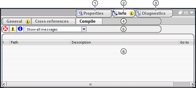
① |
Properties tab. |
|
② |
Information tab. |
|
③ |
Diagnostics tab. |
|
④ |
Navigation through additional tabs within a tab (only available in the "Information" and "Diagnostics" tabs) |
|
⑤ |
Toolbar (only available on the additional "General" and "Compile" tabs of the "Information" tab) |
|
⑥ |
Contents of the 'Compile' tab under 'Information'. |
Properties tab.
This tab displays the properties of the selected object. Here you can change the editable properties.
Information tab.
This tab displays additional information about the selected object, as well as alarms for actions performed (e.g. compilation).
Diagnostics tab.
This tab contains information on system diagnostic events, configured alarm events and call diagnostics.
Tabbed navigation
You can use area navigation and lower-level tabs to display the information you need on the tabs.
toolbar
Using the toolbar on the "General" and "Compile" tabs of the "Information" tab, you can specify which types of alarms are to be displayed. You can enable or disable the display of the following alarm types:
- Errors
- Warnings
- Information
|
Basics of task cards |
Task card function
Depending on the object being edited or selected, task cards are available to perform additional actions. These activities include:
- Selecting objects from the library or from the equipment catalogue
- Searching for and replacing objects in a project
- Dragging predefined objects onto the work area
You will find the available task cards in the bar on the right-hand side of the screen. You can collapse them and reopen them at any time. Which task cards are available depends on the products installed . More complex task cards are divided into panels, which can also be collapsed and reopened.
Layout of task sheets
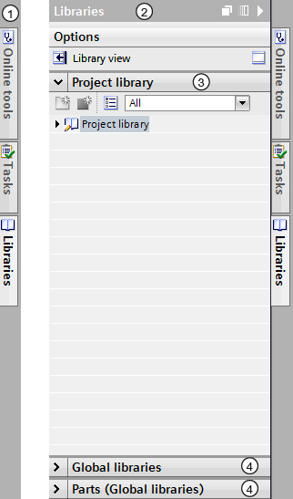
The figure below shows an example of a task card bar:
|
① |
Closed task sheets |
|
② |
Open task sheet |
|
③ |
Open task card palette |
|
④ |
Closed task card palette |
|
Changing the panel mode |
You can choose between two panel modes:
- Single panel mode:
Only one window is open at a time. If you open another window, the previously opened window is automatically closed.
- Multi-window mode:
You can open several windows at the same time.
Procedure
To change the panel mode, follow these steps:
|
|
Reference projects |
Function of reference projects
In the "Reference projects" palette, you can open other projects in addition to the current project. These reference projects are write-protected and cannot be edited. However, you can drag the reference project objects into the current project and edit them further there. You can also compare the reference project objects with those of the current project.
Layout of the 'Reference Projects' palette.
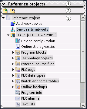
The figure below shows the layout of the 'Reference projects' palette:
|
① |
Title bar |
|
② |
toolbar |
|
③ |
Open reference projects |
Title bar
The closing arrow is located in the title bar of the 'Reference Projects' palette. When closed, the direction in which the arrow points changes from bottom to right. This can now be used to reopen the palette.
toolbar
The toolbar contains buttons for opening and closing reference projects.
Open reference projects
Open reference projects are displayed as read-only with their objects and hierarchical structure.
|
View of details |
Purpose of the detail view
The detail view shows what content of the selected object is in the overview window or in the project tree. This can include text lists or tags.
Layout of the detail view
The figure below shows an example of a detail view:

|
① |
Title bar |
|
② |
Patka |
|
③ |
Content of the selected object |
Title bar
The closing arrow of the detail view is located in the title bar of the detail view. When closed, the direction indicated by the arrow changes from left to right. It can now be used to reopen the detail view.
Patka
The tab displayed in the detail view depends on the object selected.
- The 'Modules' tab is displayed when a device, a link to a device or a folder containing one of these objects is selected.
The 'Modules' tab displays the installed modules or submodules of the device in a detailed view, after selecting the device itself or the device link in the project tree.
- "IO tags" displays existing IO tags for the selected devices and links to the devices below the "Local modules" folder or the devices folder. In addition to the data type and address, the name of the simple tag or data element of the PLC data type is displayed.
|
Note If a simple tag has been defined for the channel address, but it is also in the address range of the data element of the PLC data type, only the name of the simple tag is displayed. |
- The "System constants" tag is displayed if you select a link to a device below the devices folder in the "Distributed I/O" folder or in the "Unassigned devices" folder.
The "System constants" tab displays the global constants used by the device with hardware identifiers, e.g. modules, submodules and interfaces.
Facilities
The content displayed varies depending on the selected object. You can move the content of objects from the details view to the required location using drag and drop.
|
Overview window |
Functions of the Overview window
The Overview window completes the project tree. The Overview window shows the contents of the folder currently selected in the project tree.
In addition, you can perform the following actions in the Overview window:
- Open objects
- Display and edit object properties in the Inspector window
- Rename objects
- Invoke object-specific actions from the shortcut menu
- Compare objects side by side
- Perform various operations on objects, such as inserting objects from the library by dragging and dropping and moving, copying, pasting and deleting objects
Window layout Overview
The figure below shows the elements of the Overview window:

|
① |
Overview window |
|
② |
Go to details view |
|
③ |
Go to list view |
|
④ |
Switch to icon view |
|
⑤ |
Take it to the next level |
|
⑥ |
Divide the overview window into two halves. The right or left half of the overview window is synchronised. Clicking again cancels the division. |
|
⑦ |
All items in the selected folder are displayed, even if they are in lower level groups. This option is only available in the details view. |
|
⑧ |
Contents of the object selected in the project tree. |
View the forms of the Overview window
The contents of the Overview window can be displayed as follows:
- View of details
Objects are displayed in a list with additional information, such as the date of the last change.
- List view
Objects are displayed in a simple list.
- View of icons
Objects are displayed as icons by category.
|
Comparing objects in the overview window |
In the Overview window, you can display the contents of two folders or objects side by side. The Overview window is divided in half and you can display different content on the left and right sides.
In addition, you can use drag-and-drop operations to move objects between split windows. In this way, you can, for example, move content from one window to another.
Procedure
To split the Overview window in half or cancel the split, follow these steps:
|
|
Sorting the details view of the overview window |
You have several options for customising the display in the details view of the overview window:
- Adding additional columns
Some columns are hidden by default to increase transparency. You can display hidden columns if required. The available columns depend on the selected object.
- Displaying the contents of folders in a flat hierarchy
The contents of a folder can be displayed in a flat hierarchy. The entire content is displayed simultaneously, even if it is in different groups.
- Sorting table columns
You can sort the individual columns of the table in ascending or descending order.
Showing or hiding columns
To show or hide additional table columns, follow these steps:
|
Displaying the contents of a folder in a flat hierarchy
To display the contents of a folder in a flat hierarchy, follow these steps:
All items are displayed in the table at once, even if they are in subfolders. |
Sort table in ascending or descending order
To sort the table by column in ascending or descending order, follow the steps below:
|


